DashCam & Society Hill Album Covers

DashCam Album Cover Society Hill Album Cover

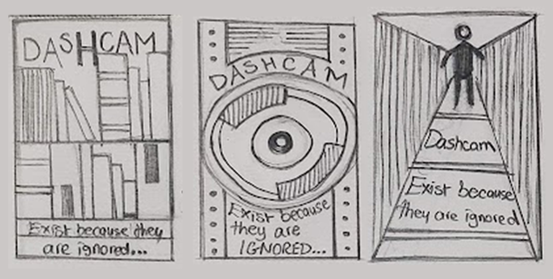
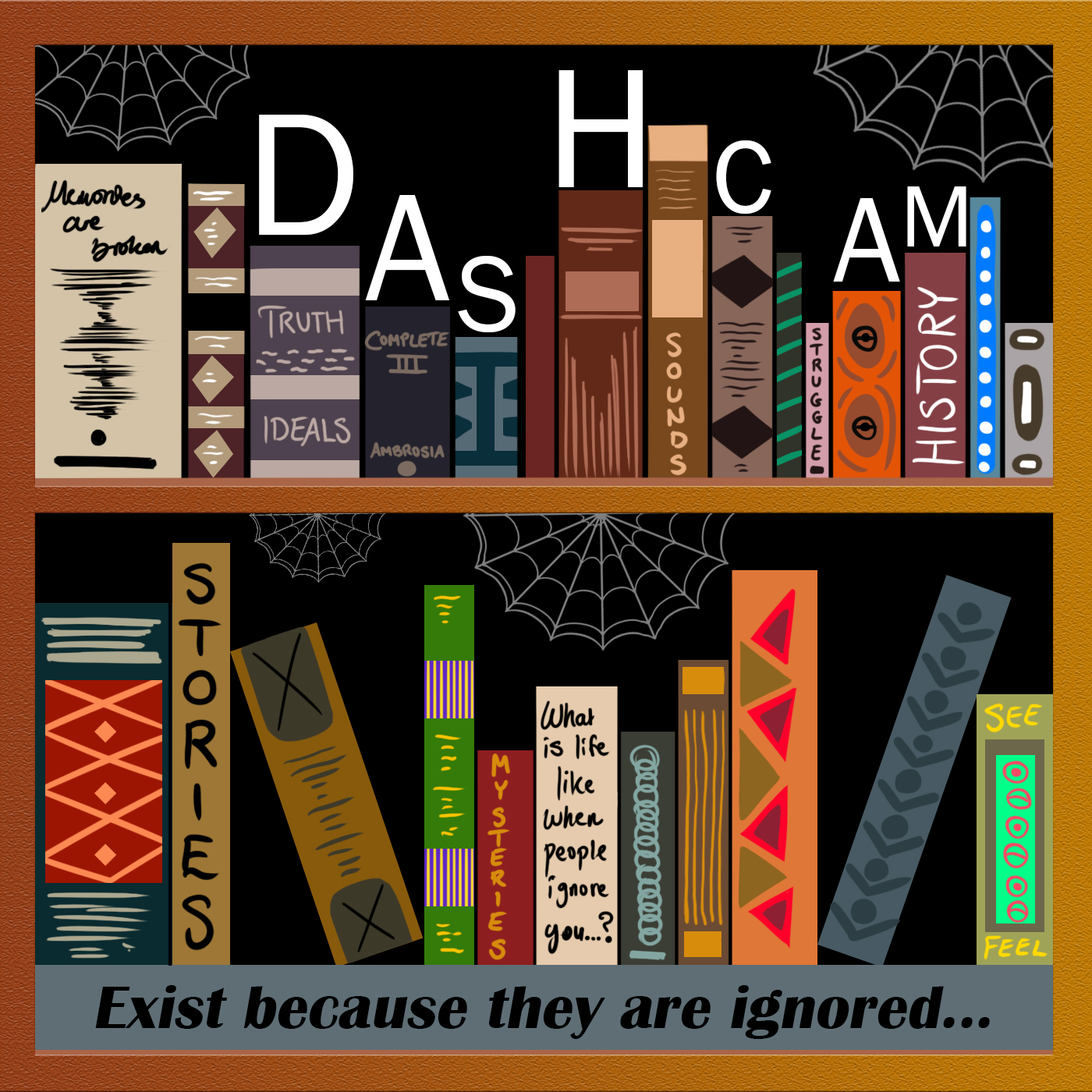
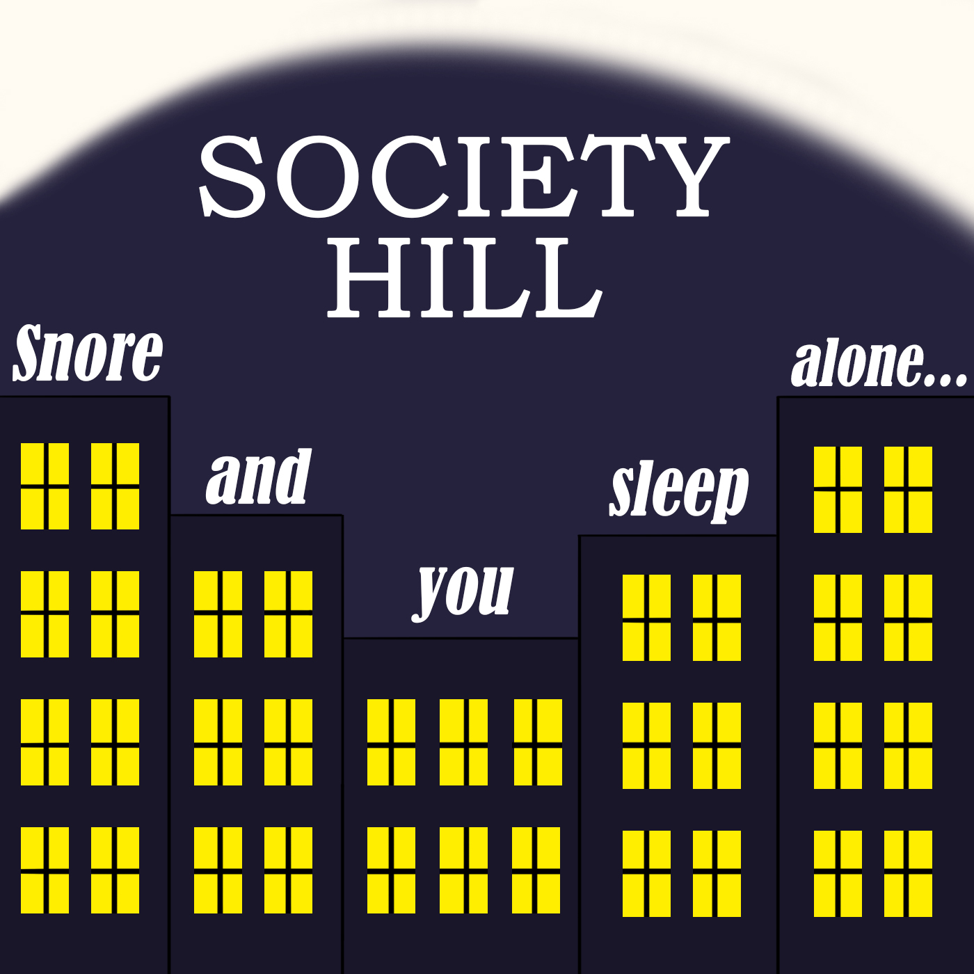
Tool(s) used: Adobe Photoshop

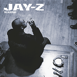
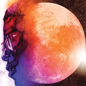
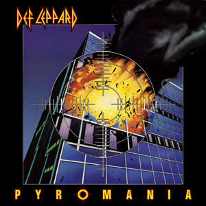
My DashCam and Society Hill albums was a start to my potential as a future graphic designer. I researched three different album covers and described the overall theme and appearance. Once I had an idea on what my general theme is, I sketched my albums. This was the challenging part because I had to think of an album that goes well with the name. The first one was called Dashcam, so I sketched a bookshelf and the second name was Society Hill, so I sketched some buildings in a nighttime setting. Finally, I went on to Adobe Photoshop and brought these sketches to life by adding full colour. What I learned from this experience is finding creative ways to connect visuals with themes and names, while also improving my skills in translating rough sketches into polished digital designs. It taught me how to think conceptually, experiment with different styles, and effectively use tools like Adobe Photoshop to bring my ideas to life. I think music albums are important to this day because there are many genres that use a variety of colours that stand out, especially in older albums from the 1990s to late 2000s.

DashCam Album Cover Research

Jay-Z Album Cover

The Jay Z album is very striking. I chose this cover because of the contrast surrounding Jay Z’s back and the black shoes on the top right of the cover. The lighting and attention to detail on the table also stands out, giving it a sort of “life on the crime” scene.

Kid Cudi Album Cover

The Kid Cudi album has a balance of dark and light. I like how his face is attached to the moon, since it relates to the name of the album - “Man on the moon: The End of Day.” The vibrant colours, most notably purple and orange is a great combination of mixtures and I am planning to use something similar for my own album cover.

Kendrick Lamar Album Cover

The Kendrick Lamar, 'Good Kid, M.A.A.D City' album gives off a sort of 80s vibes, just by looking at this cover. I liked the cracks on the road and the white cracks surrounding the cover. Feels like it’s meant to tell a story.

DashCam Album Cover Sketches

Image 1

Sketch #1: In this design, I wanted the bookshelves to be the main focus and use different sizes. Books can be forgotten by many people, particularly those who are close-minded. I want to make the colours vibrant.

Sketch #2: I wanted to make the second sketch look more unique. So I used a camera and added patterns and details surrounding the camera. It’s meant to closely resemble the name of my album band, “DashCam.”

Sketch #3: With this sketch, I wanted to use an actual person walking away from a bridge, to show the viewers he/she exists, but they are ignored. I would like to add attention to detail to the bridge, the person, and the sidewalk.

Society Hill Cover Research

Pyromania Album Cover

The Jay Z album is very striking. I chose this cover because of the contrast surrounding Jay Z’s back and the black shoes on the top right of the cover. The lighting and attention to detail on the table also stands out, giving it a sort of “life on the crime” scene.

Dimensions Album Cover

The Dimensions album uses light and dark colours of orange and yellow. I like the cool x symbol because it reminds me of a pattern I see many times online. The glow also makes it really stand out

Led Zeppelin - Celebration Day

The Celebration Day album cover by Led Zeppelin is my favourite one from the three rock album covers so far. I love the amount of detail added.The use of red and yellow for the sun and the aqua green for the water. Celebration Day’s setting taking place during the sunset makes it more full of life. I am definitely implementing similar ideas like this to my album cover

Society Hill Sketches

Image 2

Sketch #1: In this design, I wanted to depict a man sleeping on top of a hill. I was trying to make the album closely relate to the title name, “Society Hill” and the album title “snore and you sleep alone.” The bed needs to stand out more as well as the mountains.

Sketch #2: I wanted to make the second sketch look more unique. So I used a camera and added patterns and details surrounding the camera. It’s meant to closely resemble the name of my album band, “DashCam.”

Sketch #3: Lastly, for this sketch, I used wind patterns to resemblance snoring. I was thinking of adding the album band name inside the wind and make the text vertical or diagonal. My least favourite from the three, but I think it has potential to make it shine.

Back to Branding & Visual Identity Back to Portfolio Next →