Tool(s) used: Adobe Photoshop
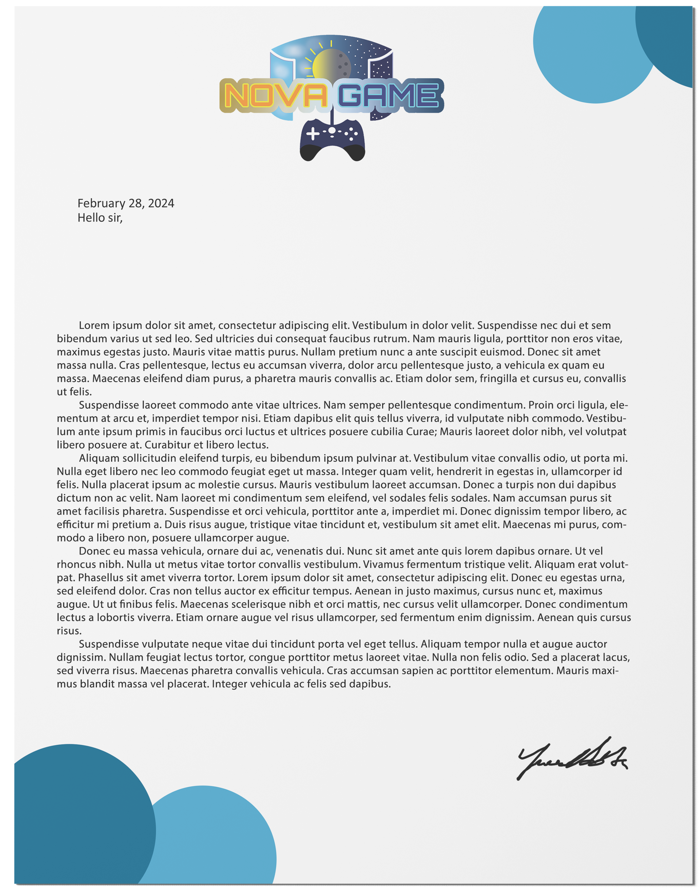
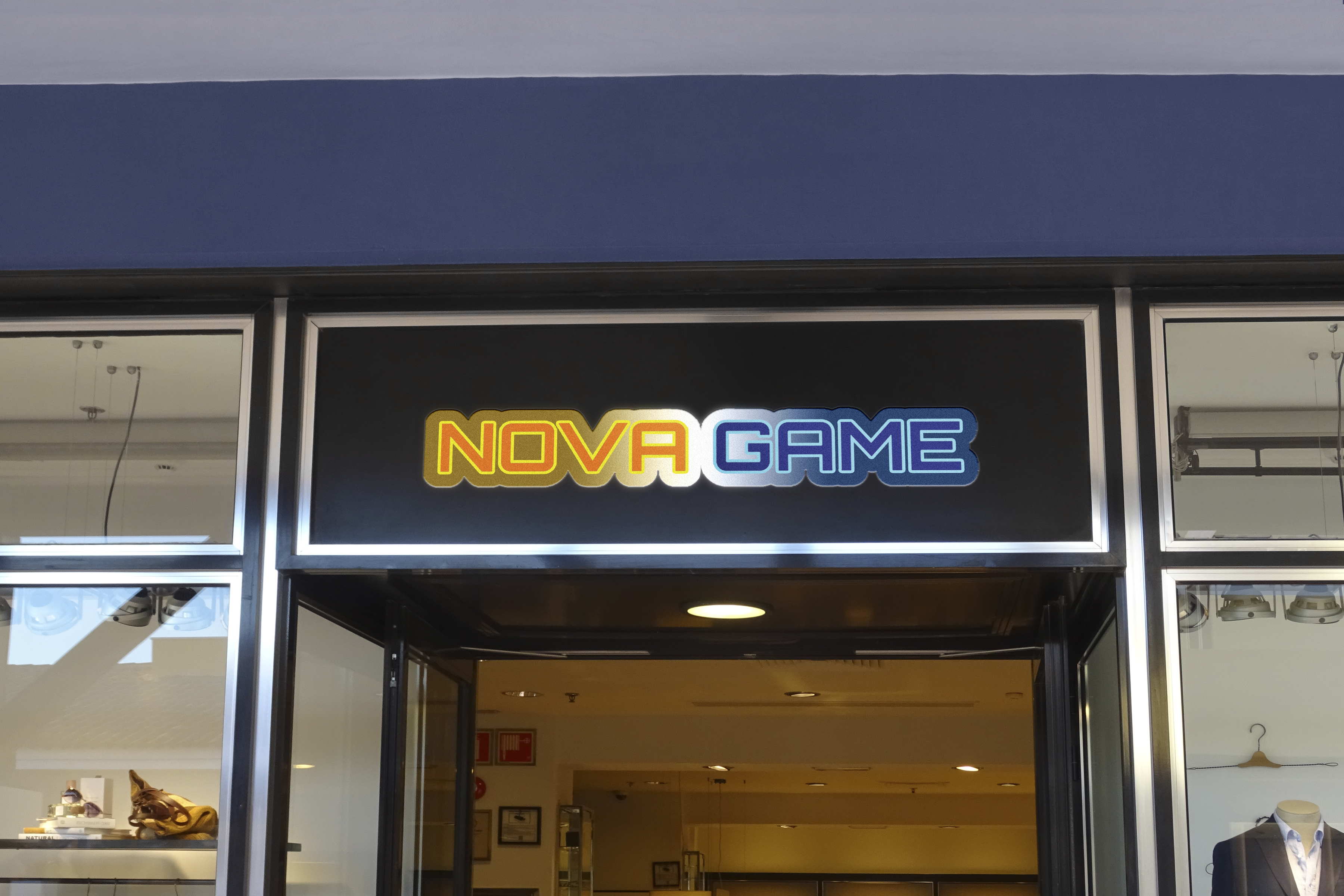
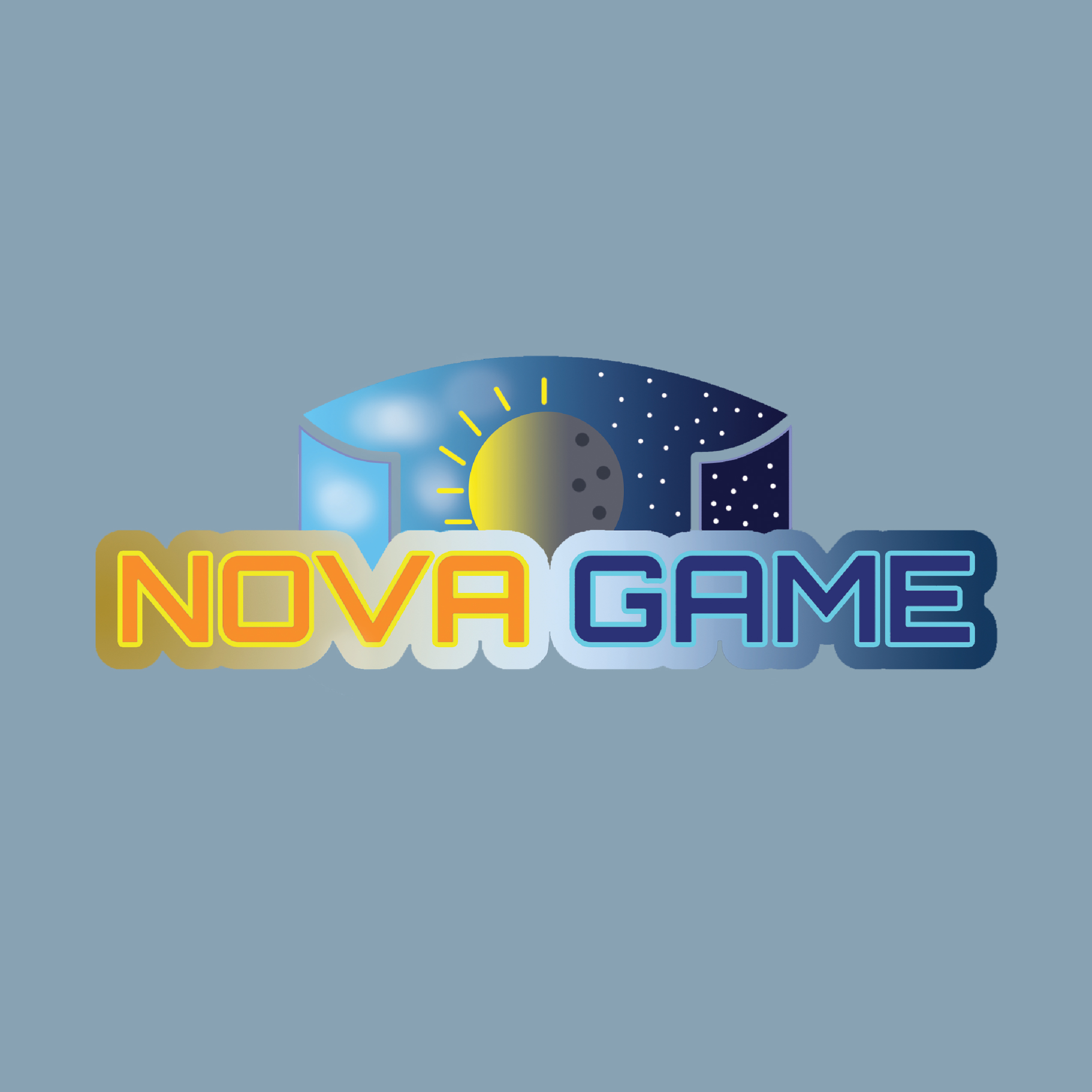
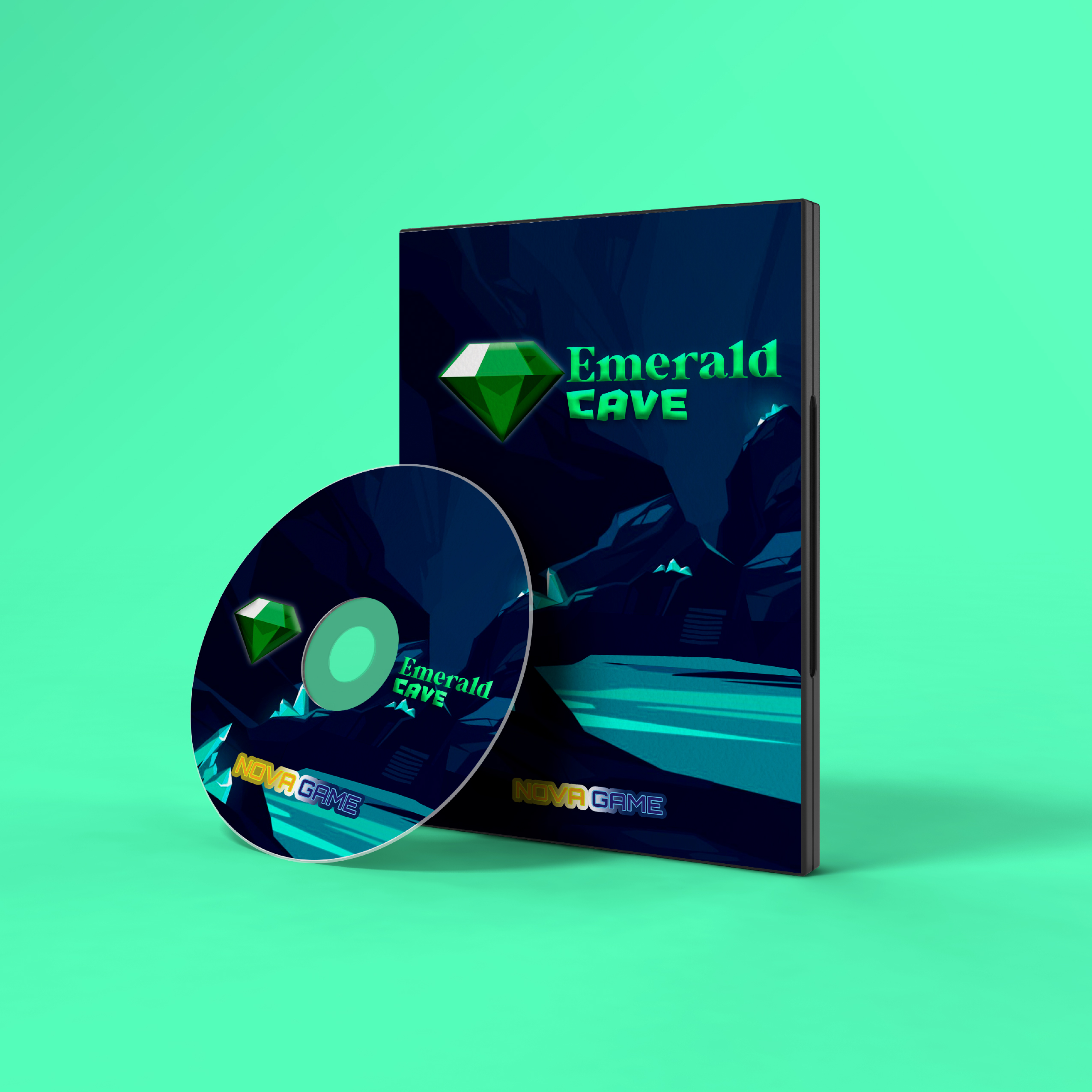
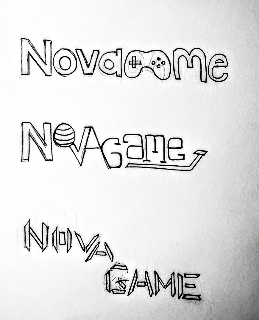
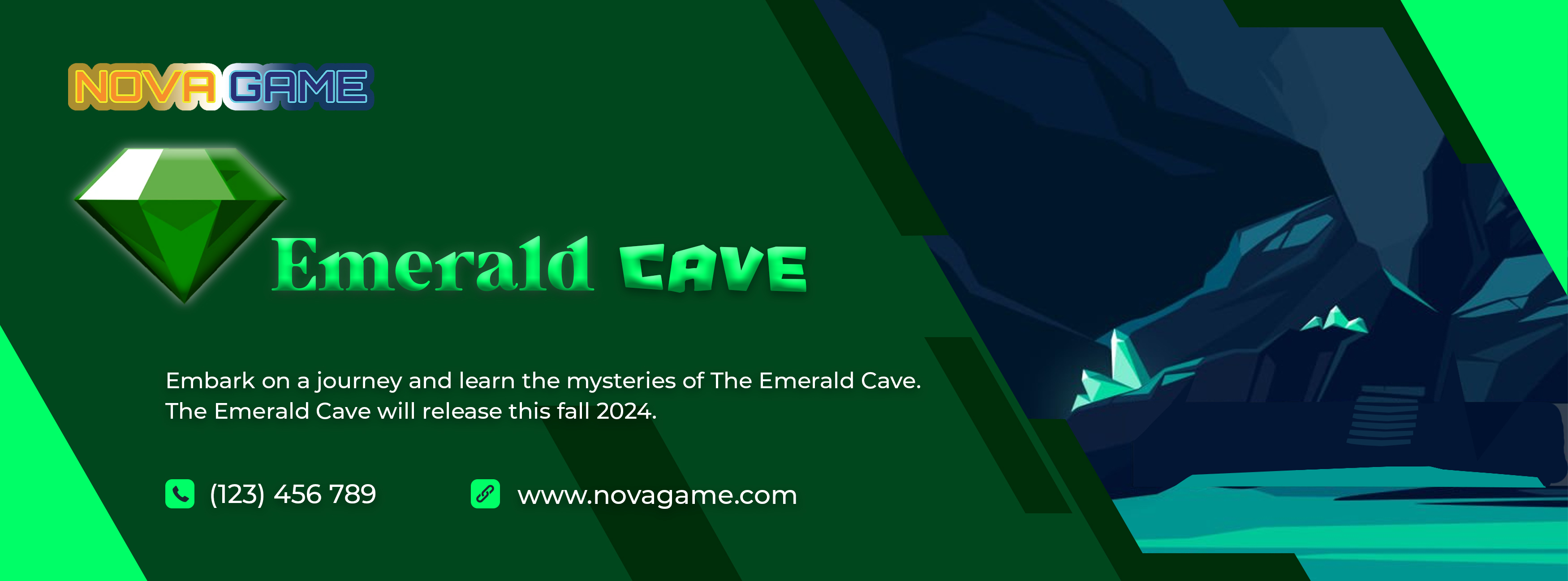
For Nova Game, I started off by drawing some sketches on what Nova Game would look like. So I implemented different icons such as a ball or a controller to the logo. After some thinking and consideration, I made a star and moon and added it to the logo. For typography, I used a regular font for Nova and used a pixel font for Game. In Branding 2, I decided to give it a rework on the logo and completely changed it. I used Adobe Photoshop to update the logo and I added a controller to the bottom of the logo. I made one side of the logo feature day and the other side night - showcasing that with Nova Game you can play games during the day or night. What I learned from this project is how to develop and evolve a brand concept from initial sketches to a fully realized identity. This experience taught me the importance of iteration and how visual elements, like logos and campaigns, can convey a brand’s story.


.png)

.jpg)